Customising your Destination Store with the Store Designer
The Store Designer lets you control the appearance and behaviour of an individual store. You can update the homepage hero, category layout, fonts, colours, section backgrounds, contact details and customer prompts.
Open the store you want to customise, then go to its Store Designer. Save your changes when you are finished.
Hero
The hero is the section at the top of your homepage.
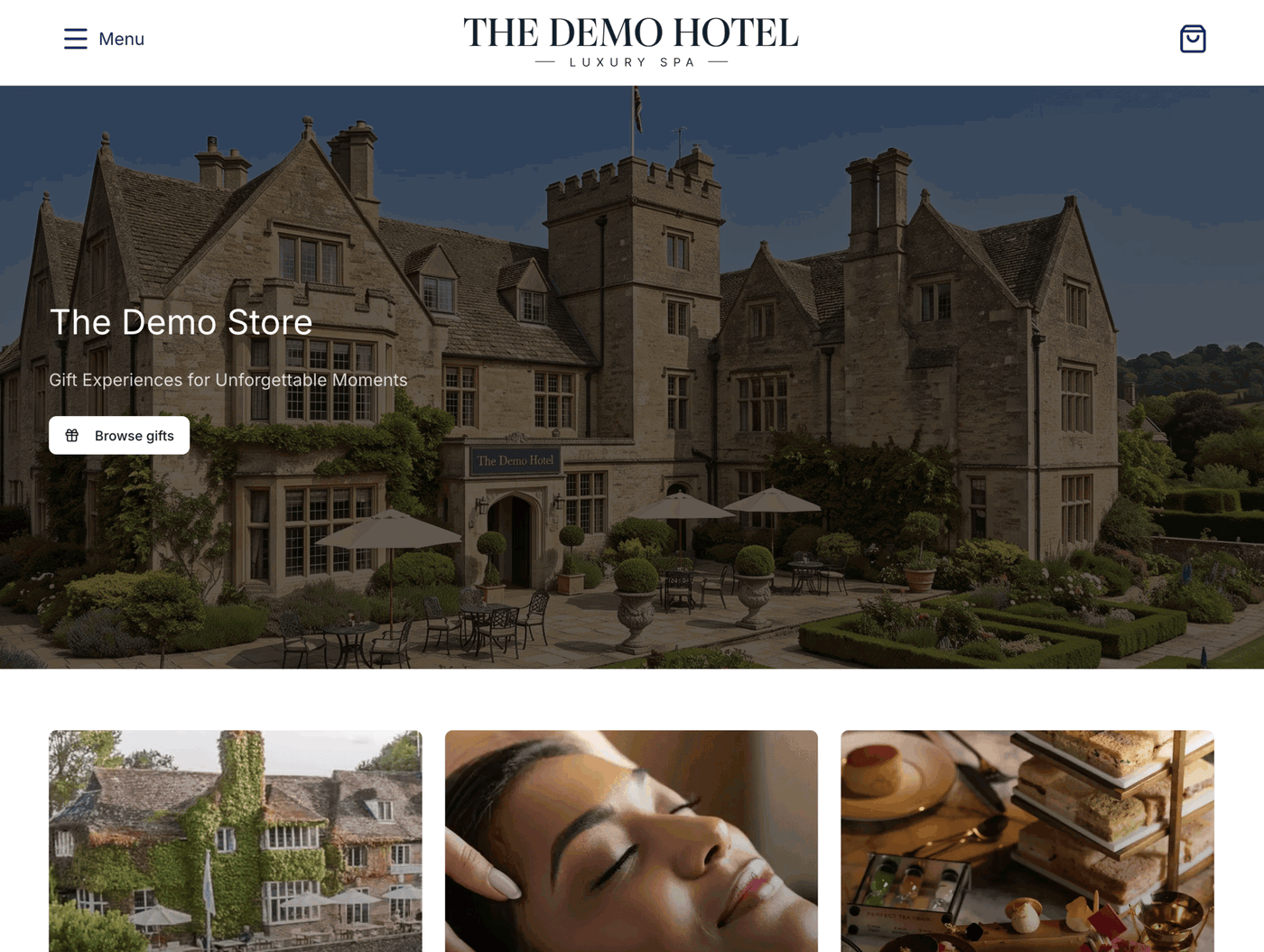
Text and button
Hero heading text: The main heading displayed over the hero. Leave it empty to hide it.
Hero subtitle: Supporting text below the heading. Leave it empty to hide it.
Hero button text: The label on the hero button. Leave it empty to hide the button.
Choose what the hero button does:
Scroll to products: Scrolls down to the product listings. This is the default.
Show the store switcher: Opens a dropdown of your other stores. This requires a custom store switcher group. If one has not been set up, the button scrolls to the products instead. (see store switcher for more information)
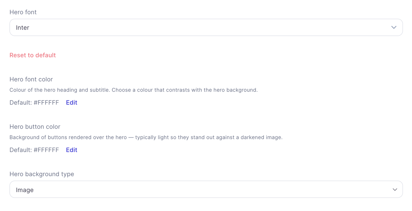
Font and colours
Choose the hero font, hero font colour and hero button colour. The heading and subtitle use the hero font colour. Pick colours that remain easy to read against your background image.
Background image and overlay
If you select an image as the hero background type, upload a landscape JPEG or WebP image that is at least 1200 pixels wide. It will be displayed across the full width of the hero.
You can add an overlay colour and adjust its opacity to tint the image and make the text easier to read. The overlay settings apply only when the hero background is an image.
Category layout
Choose how category cards appear on the homepage:
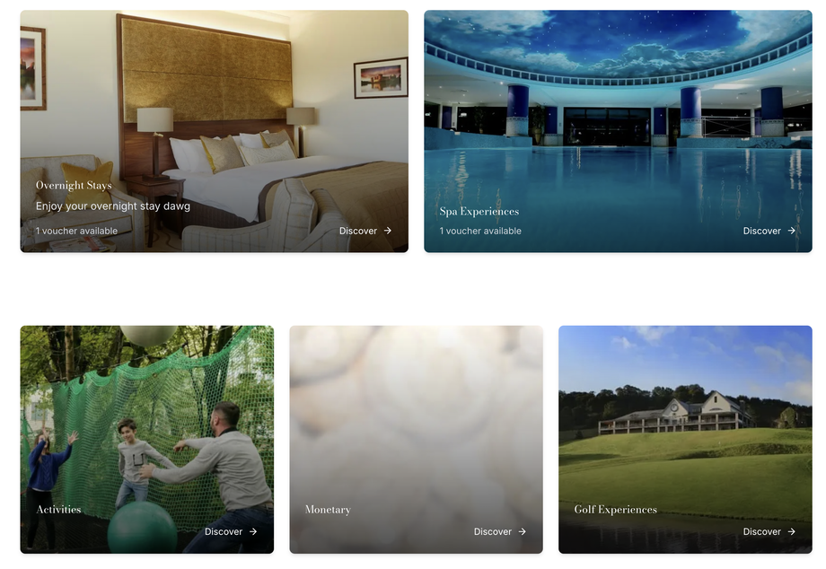
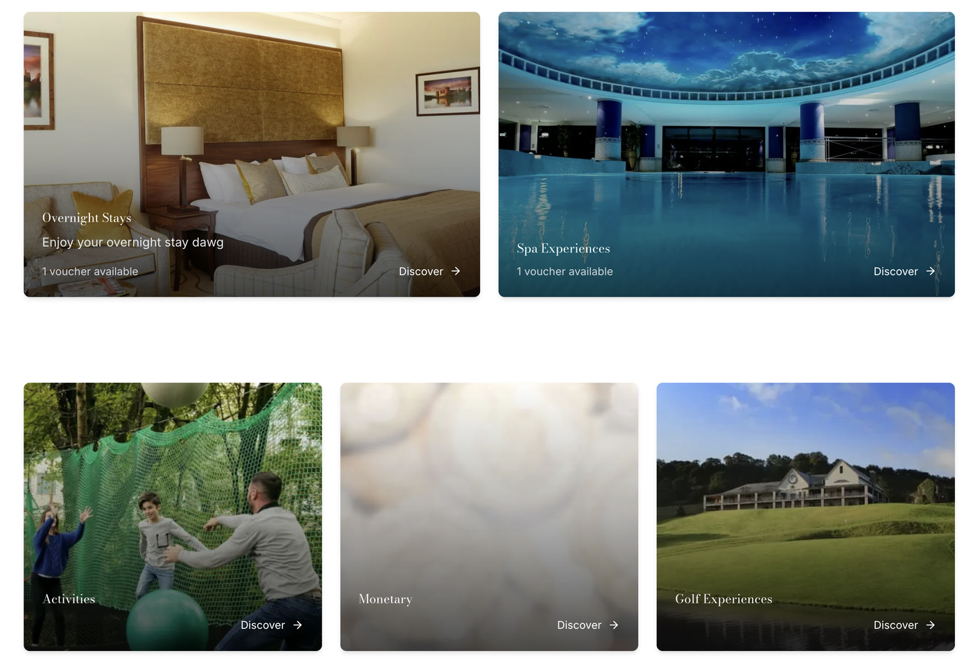
Featured category layout: Displays the first two categories as larger featured cards, followed by standard cards for the remaining categories.
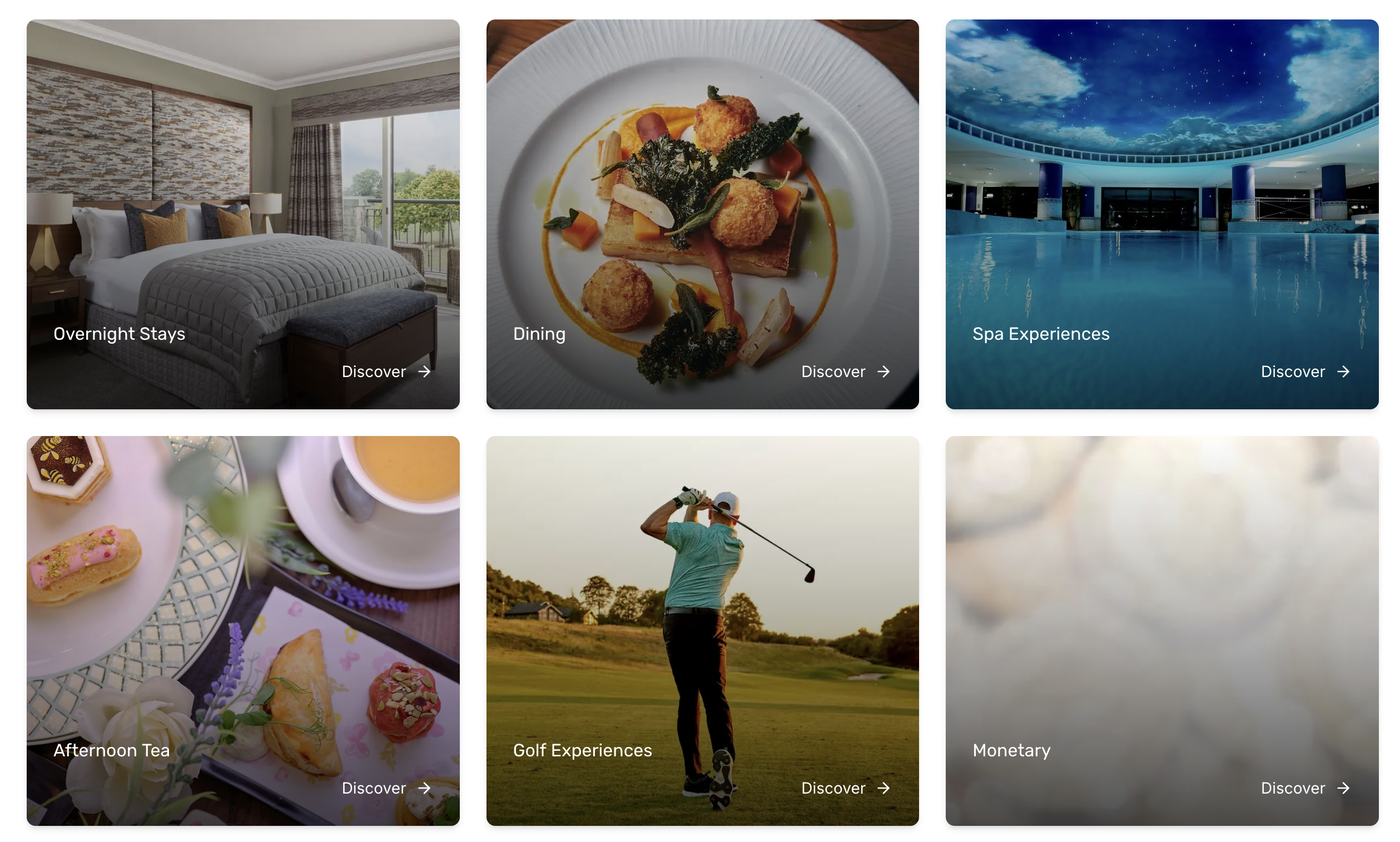
Uniform category layout: Displays all category cards at the same size.
If you use the featured layout, place the categories you want to highlight in the first two positions.
Contact details
Add the contact information you want customers to see. Fields left empty are hidden.
Contact email: Appears in the footer and on the FAQ, balance, terms, privacy and delivery pages.
Contact phone: Appears in the same locations as the contact email.
Contact hours: Appears in the footer and on the FAQ and balance pages.
Website URL: Appears on the storefront when provided.
Navigation bar
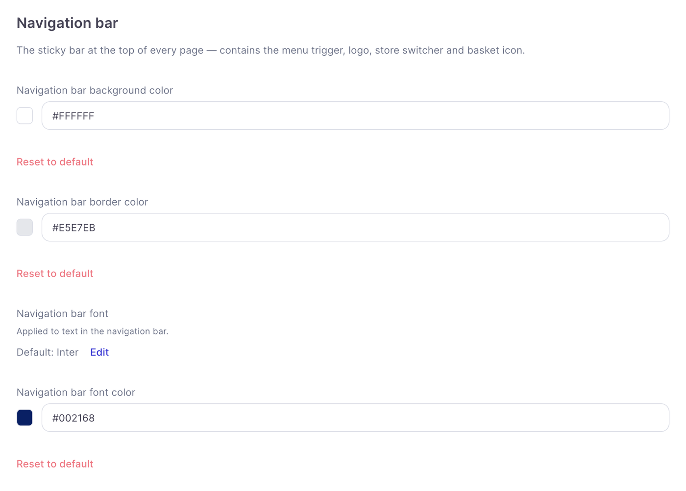
The navigation bar stays at the top of each page and contains the menu trigger, logo, store switcher and basket icon.
Appearance
Set its background colour, border colour, font and font colour to match your store’s design.
Typography
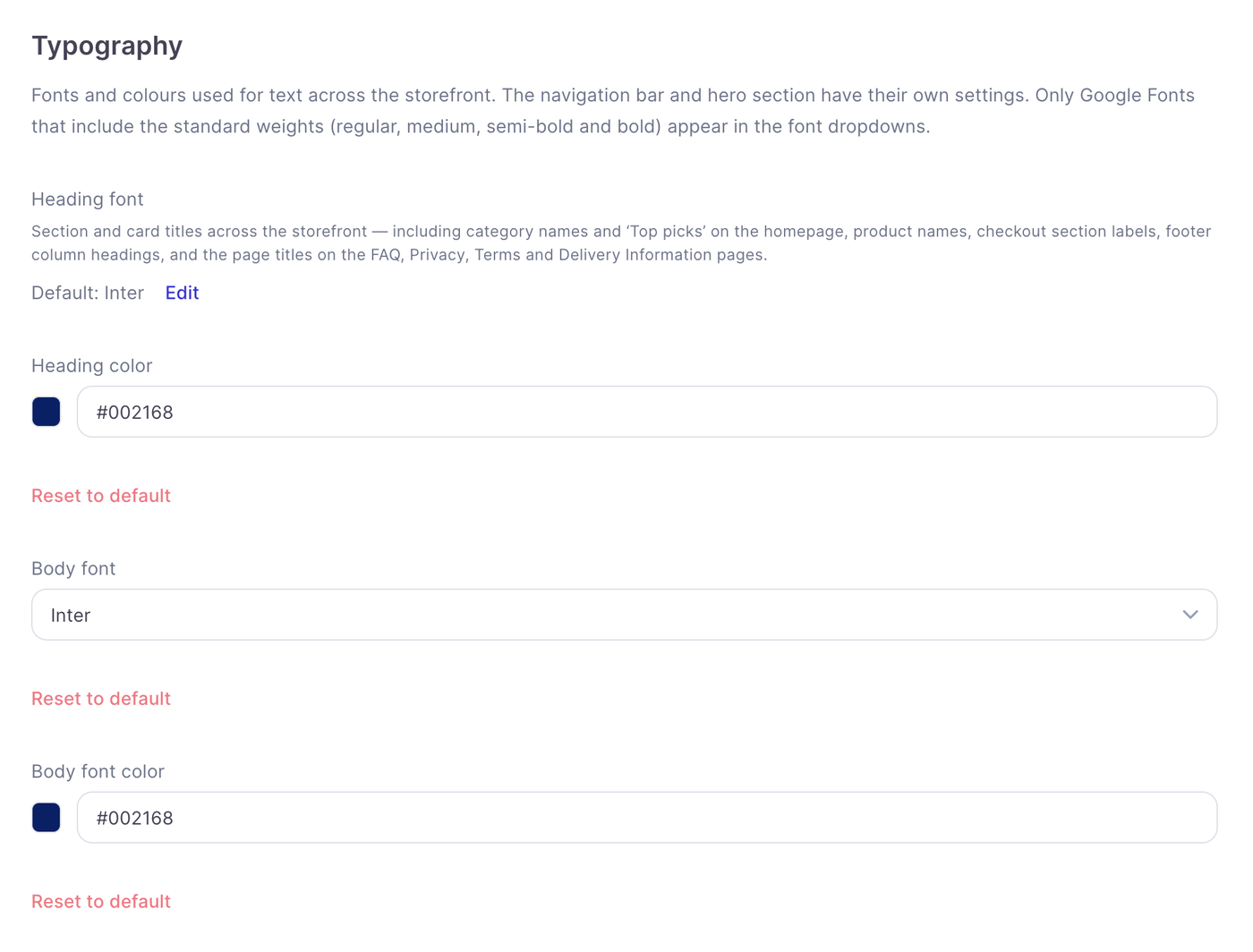
Typography settings control text across the storefront. The hero and navigation bar have their own font settings.
Heading font and colour
The heading font and heading colour apply to headings such as category names, product names, checkout section labels, footer column headings and the page titles for FAQs, Privacy Policy, Terms and Conditions, and Delivery Information.
Body font and colour
The body font and body font colour control general text across the storefront.
Only Google Fonts with regular, medium, semi-bold and bold weights appear in the font dropdowns.
Colours
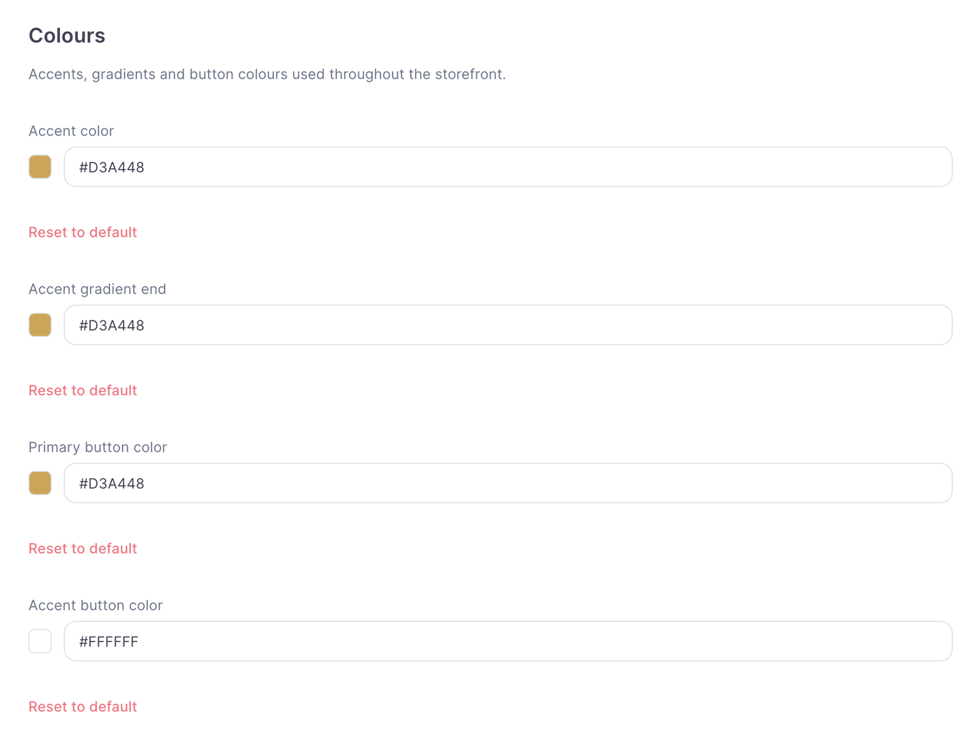
Use these settings to customise accents and buttons throughout the storefront:
Accent colour
Accent gradient end
Primary button colour
Accent button colour
Check that text and buttons remain clear against the surrounding backgrounds.
Section backgrounds
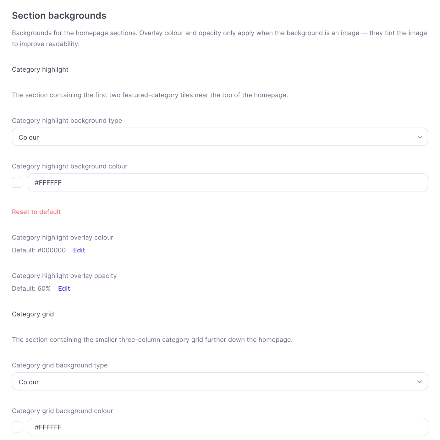
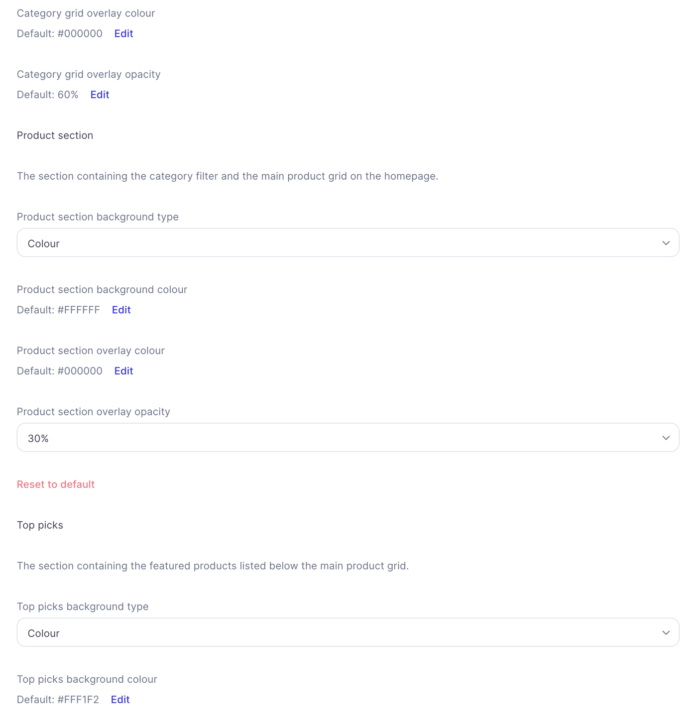
You can customise the backgrounds of individual homepage sections. Depending on the section’s background type, you can set a background colour or image. When using an image, overlay colour and overlay opacity let you tint it to improve readability.
Category highlight
Controls the section containing the first two featured category tiles near the top of the homepage.
Category grid
Controls the section containing the smaller, three-column category grid further down the homepage.
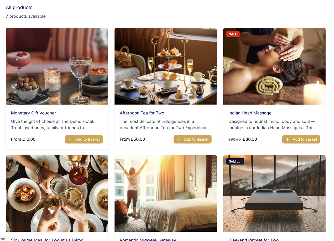
Product section
Controls the section containing the category filter and main product grid.
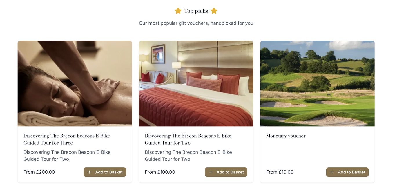
Top picks
Controls the section containing featured products below the main product grid.
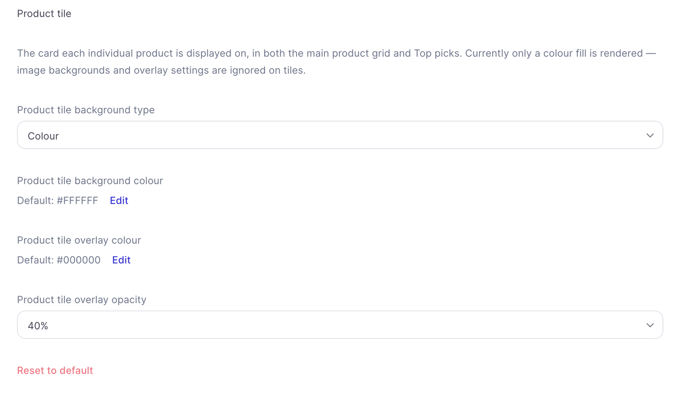
Product tile
Controls the background colour of individual product cards in the main grid and Top picks. Product tiles currently display a colour fill only. Image backgrounds and overlay settings are not rendered on these tiles.
Footer
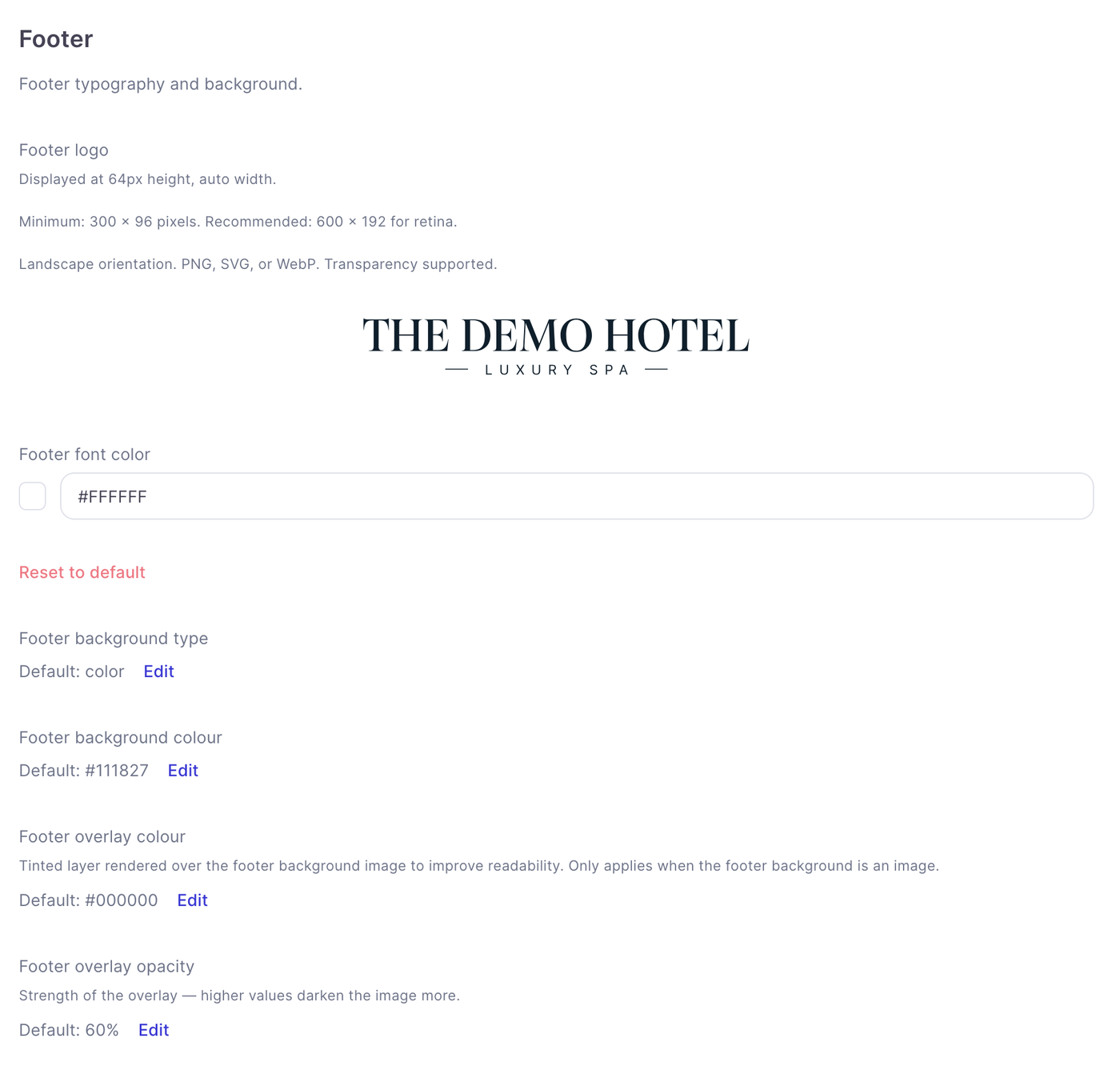
Customise the footer’s logo, font colour and background.
Footer logo
Upload a landscape PNG, SVG or WebP image. Transparency is supported. The image must be at least 300 × 96 pixels; 600 × 192 pixels is recommended for sharper display. The logo appears at a height of 64 pixels, with its width adjusted automatically.
Background and text
Choose a footer background type and set the footer font colour. If you use a background image, you can adjust the overlay colour and opacity to keep the text readable.
Featured content
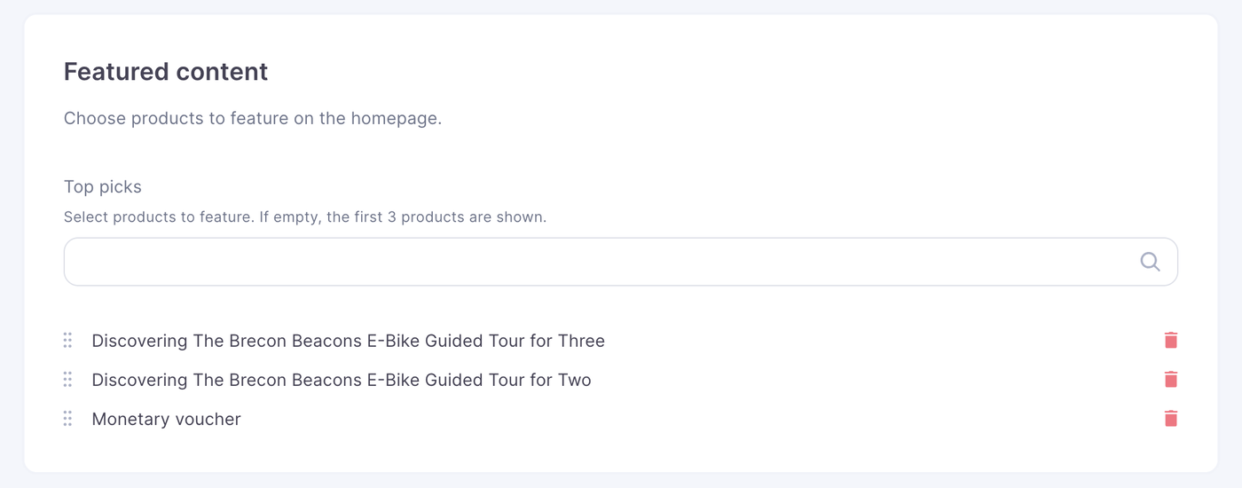
Top picks
Select the products you want to feature in Top picks on the homepage. If you do not select any, the first three products are shown automatically - this appears in its own section at the bottom of the page.
Features
These settings control prompts and tools available during the customer journey.
Personalisation dialog
Turn on Show personalisation dialog to prompt customers to personalise their voucher after adding a product to the basket.
Enhancements dialog
Turn on Show enhancements dialog to prompt customers to add enhancements after adding a product to the basket.
Voucher lookup
Turn on Show voucher lookup to let customers check a voucher’s balance and status on the storefront.
Resetting a setting
Where Reset to default appears, use it to restore that setting’s default value.
When you are finished, press done but make sure you save on the store page as well or any changes you make wont save!
Here is are recommended settings to achieve a clean white background looking store.